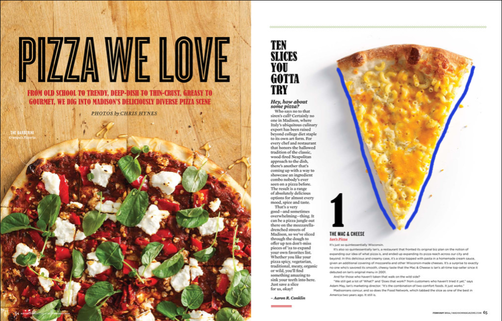
Tim Burton – Creative Director – Madison Magazine Pizza We Love, 2-Page Spread, Madison Magazine – Photos by Chris Hynes. Original magazine spread found here here
Category Identification
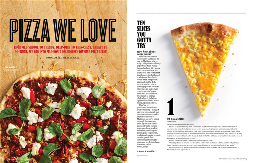
The Category of the 2 typefaces are Old Style & Modern
Typeface Contrast
There are several typeface contrasts in this magazine spread
The size of the of”Pizza We Love” and the “1”
Weight of the “Ten Slices you gotta try” and “1”
Color of the “From old school to trendy”
Also the size difference between “Pizza We Love” and “From old school..
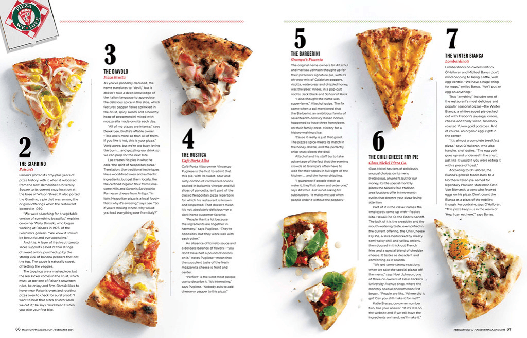
Photography – Leading Lines
The photographer utilized leading lines (in the pizza slice). Also, the lines in the pizza are also leading lines although they are more hidden.
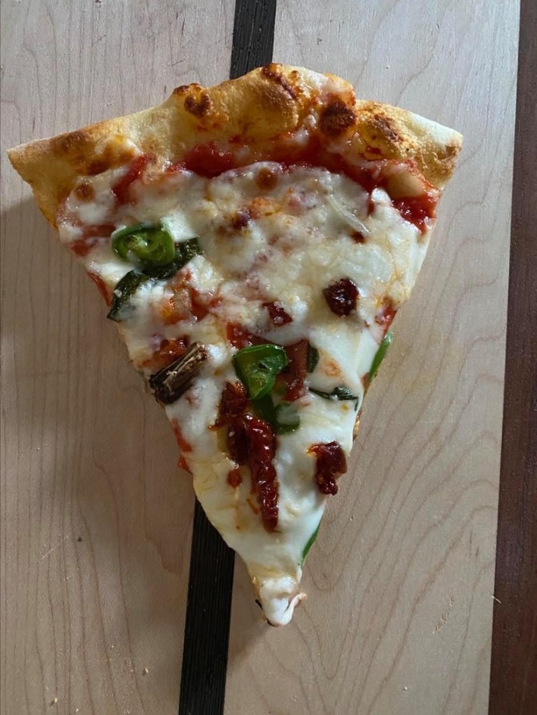
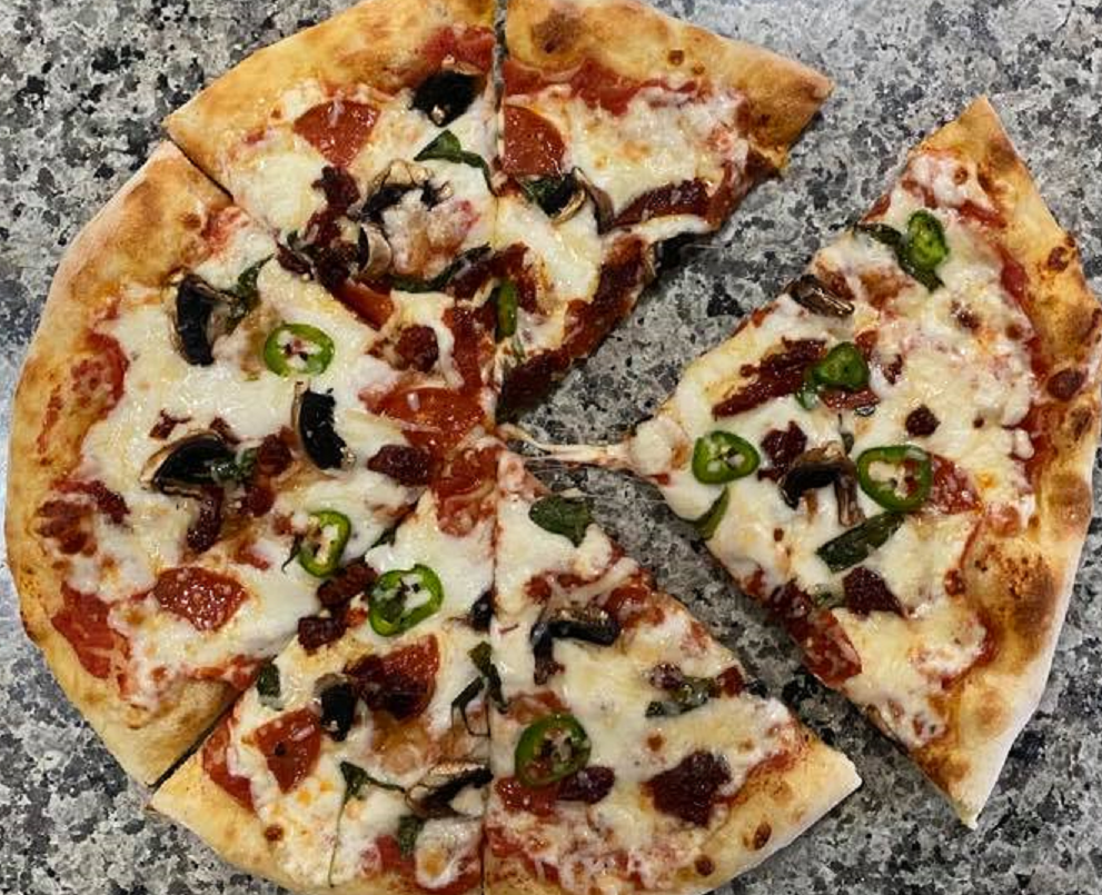
Alternate Images
I was able to mimic the images in the magazine spread by having my husband make one of his homemade pizza’s, then I had him put on his wooden board and I photographed it before it was sliced pulling the pizza down 1/2 way on the board as in the magazine photograph. I then had him slice the whole pizza so that I could also use the leading lines of the slices, but in the whole pizza. Finally I pulled one of the slices out and photographed it to match the 2nd page of the magazine spread.
Photographed by Jena Hancock Homemade pizza made by Richard HancockPhotographed by Jena Hancock Homemade pizza made by Richard HancockPhotographed by Jena Hancock Homemade pizza made by Richard Hancock
Summary
The above principles contribute to the design in several different ways. The bold fonts used in the article catch your eye right away. It is also easy to see the leading lines in a pizza. And finally I chose something that I knew that I would be able to photograph that would also fit into the magazine easily.
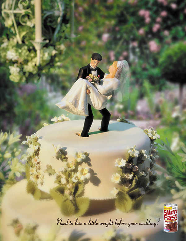
Designed by Mark Stoiber. Learn more about the great work Mark does here. Image foundhere
Intro
Slim-Fast was in a rut. It was an older brand losing market share to sexy upstarts like Jenny Craig and the diet du jour. Even worse, brand communications were running on a broken treadmill. Sad lady, insert product, happy lady, repeat.
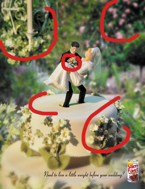
Slim-Fast’s creative team (two young ladies) were not a little offended at the template they were handed. And they simply couldn’t abide by the “show happy brides-to-be” brief for advertising Slim-Fast in wedding journals. They believed that brides-to-be were deathly afraid of gaining weight. But that didn’t mean a wedding journal should show real women distraught by extra pounds. They were already nervous wrecks – this could put them over the edge. Continue reading ….
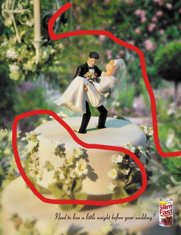
I was immediately drawn to this ad because of the beautiful cake with a Slim Fast can. I was intrigued to read on. The colors that they used were warm and inviting. When I read the tag line and how they designed the ad to be a “disrupter” as they call it, I knew immediately that this was the ad I wanted to do my Reverse Engineer assignment on. At first glance, I could easily see five principles of design.
Contrast
The contrast in this picture is the most important visual aspect. The types of contrast that were used are color contrasts, different element types like the fake flowers on the cake opposed to the real flowers in the background. They used different shapes, like the rounded corners in the tiers of the wedding cake, the bride and groom, the flowers, the candle. And finally the sizes as in the size of the wedding cake in comparison to the candle in the background and the tree and flowers in the background. The contrast makes the bride and groom sinking into the cake stand out. You also focus less on the background objects because the cake is in focus. One other thing is the font of the writing compared to the font type on the can. Also, the italic font with thin lines compared to the thick font on the Slim-Fast can.
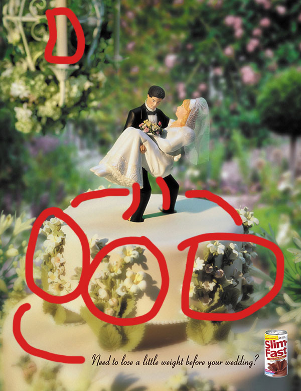
Repetition
The elements of repetition that I see throughout this design are the colors used, the different shapes of flowers, and the curved layers of the cake to name a few. The specific colors that I noticed are the pink in the bouquet repeated in the pink flowers in the background, the creme color on the cake flowers to the creme color on the candle to the creme color in the background flowers. More color repetition is the green on the leaves of the cake as well as the greenery in the background. The rounded lines on the cake as well as the rounded lines of the grooms legs, to the round holes in the cake where the groom is standing. By repeating these color schemes and other repetition it helps the viewer so they are able to follow the course of the content and understand how it all fits together consistently.
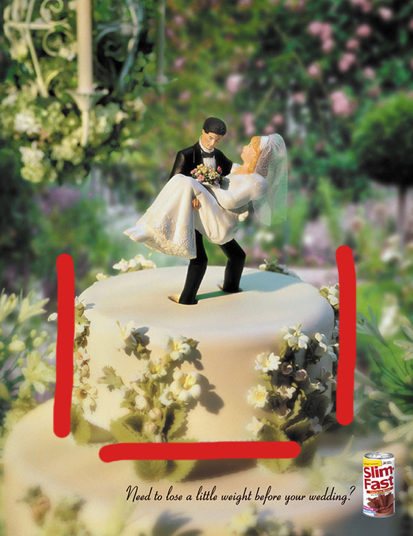
Alignment
The alignment in the picture is really obvious when you look at the lines in the cake. The cake is aligned in the center of the ad. The bride and groom are in the center of the cake. The candle stick also gives you another vertical alignment. Other elements that are visually connected is the flowers up close, then blurred out in the same areas. The top of the cake is in focus as is the bride and groom, which is the focus of the ad. The alignment in this picture gives it a clean look and feel. Things in the picture are centered while others are out of place but still with a flow.
Proximity
The proximity in the picture clearly shows how things are related. By reading the the caption you immediately see the grooms legs in the cake. Some of the other items in the ad that are grouped close together are the flower bunches on the cake, the bride and groom close together (obviously). Also, the items that are close up are the things the ad wants you to see because the closer and more in focus they are, the more they are associated. You can tell that the theme of the ad is wedding because of the poximity of everything in the picture as well as what the meaning of the ad is. Lastly because of the proximity of the feet sinking into the cake it ties everything together with the main wording of the ad “need to lose a little weight before your wedding?”
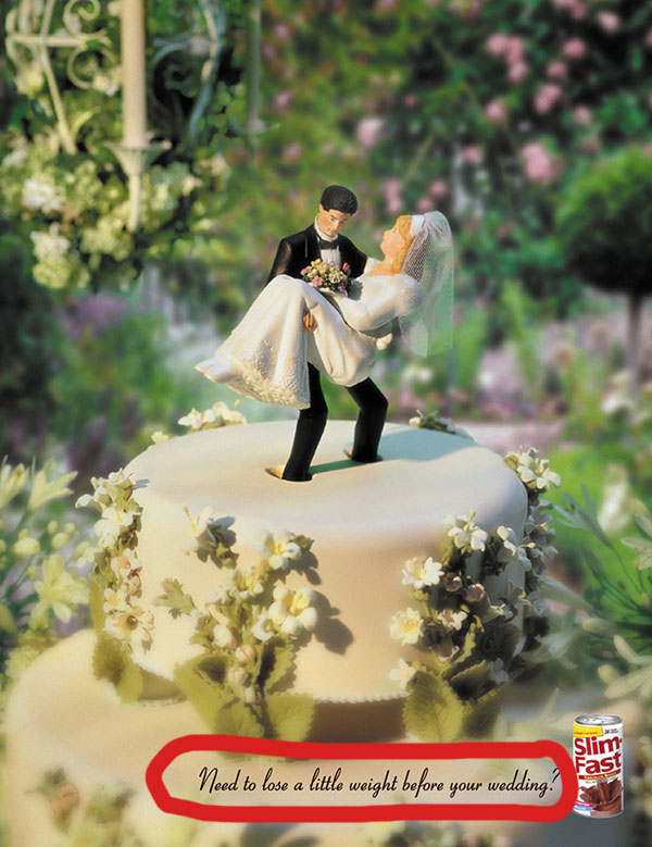
Color
Color is probably the most important part of this ad. All of the colors in the ad are very complimentary. I think if there were darker colors in the ad it would not contrast as well. The colors do not strain your eyes because it s loud. The best color contrast is using different shades of the same color which they do really well. While there is contrast between the black ink in the catch line and the picture, I think that it could have stood out a little more. Maybe they purposely made it small so that the Slim-Fast in red on the can would be more noticeable.
Summary
All of the design elements in this ad build on each other that is how you know it is a good example of an ad that will draw your attention. Almost all of the design elements. This exercise has been really helpful for me to be able to really notice these different design principles not only when looking at others work but also when creating my own work.