
Ad Campaign for Stacy’s Pita Chips
Original Ad
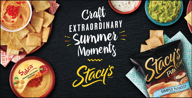
Food Stylist: Liza Jernow, Prop Stylist: Deb Donahue
Link to Stacy’s Summer Moments/Perretti Photography
New Ad
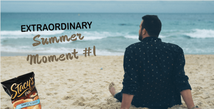
Source of Photo (Contemplating the Ocean)
Introduction
I was asked to pick a professional ad by a company that I was interested in. We were then asked to look up ads for this company on Google. We needed to make sure that the ad was well designed, had at least one line of text, the company logo was prevalent. Once we decided on our ad we needed to create a new ad in Photoshop or Illustrator. The ad we created needed to match the dimensions of the original ad, look like it was from the same campaign. We also needed to make sure that our photos were legally obtained. As I was trying to decide what company brand I wanted to choose that meant something to me, Stacy’s pita chips came to my mind first, as I eat them almost every day. When I looked up their ad’s the one above immediately caught my eye. It is bold, the colors are vibrant and I instantly had a few thoughts on what I could do so that my ad looked like it came from the same ad campaign. I thought that instead of creating an ad that looked exactly like the original ad, but with some changes, I would focus on the words of the ad “Extraordinary Summer Moments”. I then thought that I would create an ad on what would be considered a great summer moment. I immediately thought about sitting on the beach in Hawaii watching the waves. I also thought about being with friends on a boat at the lake, or on a houseboat on Lake Powell, and there were a bunch more summer moments I could create for an ad campaign.
Original Ad Analysis:
Design (Contrast, repetition, alignment, proximity)
This ad did a great job using the principles of design. I think that they did a great job with contrast. I loved the contrast of the color of the font with the background. Also they used different shapes, like the rounded edges of the hummus and tray of chips w/dips, then the square bag of chips on the square napkin. The repetition I see is again the rounded bowls, and other dishes strategically placed in the picture. They did a great job aligning the different dips around the text. The text is center aligned. Another design principle is proximity. The photographer did a great job of showing how the ingredients in the ad clearly showed how things were related to each other. The proximity of the bag of chips in the ad clearly shows what this ad is about. The statement in the ad “Craft Extraordinary Summer Moments” is represented by all of the ingredients make you think of a summer time party.
Color
The color in this ad made it pop out to me. Color is probably the most important part of this ad. All of the colors in the ad are very complimentary. I was immediately drawn in by the use of color. I like the white font with the name of the company in yellow. I like how the red color is in the hummus, to the red in the top napkin then the hint of red in the guacamole, then the red in the picture on the front of the bag of pita chips. Then the white dip to the white font color, and the light blue in the napkin and the blue on the front part of the chip bag.
Typography
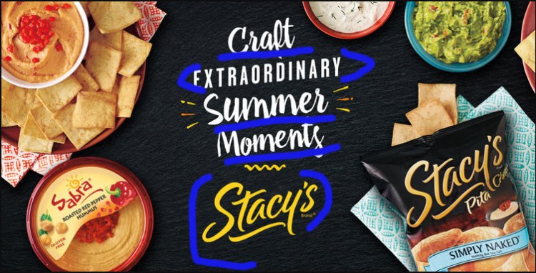
Like the color in the ad, the Typography was another important element that made the ad pop. I love the font they used in the words craft, summer and moments. The font they chose for “extraordinary” definitely complimented the font in the “summer moments” and the logo of Stacy’s. If the typography doesn’t work together then it makes the viewers eyes strain or look away. They did a great job of leaving just the right amount of white space on the page. The typography in this ad sets the mood for fun “summer moments”.
New Ad Analysis
Design (Contrast, repetition, alignment, proximity)
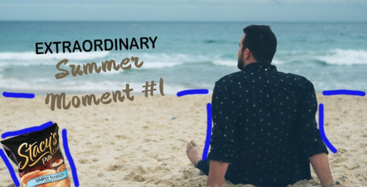
The ad design team did such a great job on the original ad that I felt it was a difficult task to follow up. One design principle I used was contrast. The contrast pieces in my ad is the ocean to sand contrast, the Stacy’s bag of chips to the sand, and also the dark hair and dark shirt that the man is wearing contrasts with the ocean and the sand. There is also contrast in the font types and colors. I used the design principle of proximity by making sure there was enough white space. I think I could have done a better job on proximity with the space in summer and moment. Lastly the elements of alignment in my ad would be the straight line with the ocean to sky, and the line of sand to ocean. I tried to carry the alignment of the text (centered, and at a slight slant) from the original ad to the new ad.
Color
The elements of color in this new ad is the black of the bag, with the black in the font in extraordinary, then the tan color of the sand with the color of the summer moment text.
Typography
The original ad did a great job with the Typography. I spent hours online trying to figure out the exact font they used. The fonts I chose in my ad were the closest I could get. I would do a couple things differently. The spacing between lines of text are a little off. Also the “summer moment” text is thicker or bold in my ad where the original ad were a closer thickness between the two different types of font. The font used on the “summer” text was a handwritten script, and the “extraordinary” is a modern font.
Conclusion
In conclusion, the new ad works together with the original ad because it “continues the story”. In the original ad, it says “Craft EXTRAORDINARY Summer Moments”, then my ad carries it on Part two of “Extraordinary Summer Moment #1”, which tells you that there are many summer events that are extraordinary that you can have “Stacy’s Pita Chips” at. I wish I could have matched the typography a little better, but other than that, I feel good about how the ads work together. It was also cool to exchange emails with the designer of Stacy’s original ad to ask permission to use her ad in my class and also to use a couple of her images in my ad.
