PIZZA WE LOVE – Magazine Spread


Tim Burton – Creative Director – Madison Magazine
Pizza We Love, 2-Page Spread, Madison Magazine – Photos by Chris Hynes.
Original magazine spread found here here

Category Identification

The Category of the 2 typefaces are Old Style & Modern


Typeface Contrast

There are several typeface contrasts in this magazine spread

  1. The size of the of”Pizza We Love” and the “1”
  2. Weight of the “Ten Slices you gotta try” and “1”
  3. Color of the “From old school to trendy”
  4. Also the size difference between “Pizza We Love” and “From old school..

Photography – Leading Lines

The photographer utilized leading lines (in the pizza slice). Also, the lines in the pizza are also leading lines although they are more hidden.


Alternate Images

I was able to mimic the images in the magazine spread by having my husband make one of his homemade pizza’s, then I had him put on his wooden board and I photographed it before it was sliced pulling the pizza down 1/2 way on the board as in the magazine photograph. I then had him slice the whole pizza so that I could also use the leading lines of the slices, but in the whole pizza. Finally I pulled one of the slices out and photographed it to match the 2nd page of the magazine spread.

Photographed by Jena Hancock
Homemade pizza made by Richard Hancock
Photographed by Jena Hancock
Homemade pizza made by Richard Hancock
Photographed by Jena Hancock
Homemade pizza made by Richard Hancock

Summary

The above principles contribute to the design in several different ways. The bold fonts used in the article catch your eye right away. It is also easy to see the leading lines in a pizza. And finally I chose something that I knew that I would be able to photograph that would also fit into the magazine easily.

Need to lose a little weight before your wedding?

Slim Fast Brand Disruption
Designed by Mark Stoiber. Learn more about the great work Mark does here. Image found here

Intro

Slim-Fast was in a rut. It was an older brand losing market share to sexy upstarts like Jenny Craig and the diet du jour. Even worse, brand communications were running on a broken treadmill. Sad lady, insert product, happy lady, repeat.

Slim-Fast’s creative team (two young ladies) were not a little offended at the template they were handed. And they simply couldn’t abide by the “show happy brides-to-be” brief for advertising Slim-Fast in wedding journals. They believed that brides-to-be were deathly afraid of gaining weight. But that didn’t mean a wedding journal should show real women distraught by extra pounds. They were already nervous wrecks – this could put them over the edge. Continue reading ….

I was immediately drawn to this ad because of the beautiful cake with a Slim Fast can. I was intrigued to read on. The colors that they used were warm and inviting. When I read the tag line and how they designed the ad to be a “disrupter” as they call it, I knew immediately that this was the ad I wanted to do my Reverse Engineer assignment on. At first glance, I could easily see five principles of design.


Contrast

The contrast in this picture is the most important visual aspect. The types of contrast that were used are color contrasts, different element types like the fake flowers on the cake opposed to the real flowers in the background. They used different shapes, like the rounded corners in the tiers of the wedding cake, the bride and groom, the flowers, the candle. And finally the sizes as in the size of the wedding cake in comparison to the candle in the background and the tree and flowers in the background. The contrast makes the bride and groom sinking into the cake stand out. You also focus less on the background objects because the cake is in focus. One other thing is the font of the writing compared to the font type on the can. Also, the italic font with thin lines compared to the thick font on the Slim-Fast can.


Repetition

The elements of repetition that I see throughout this design are the colors used, the different shapes of flowers, and the curved layers of the cake to name a few. The specific colors that I noticed are the pink in the bouquet repeated in the pink flowers in the background, the creme color on the cake flowers to the creme color on the candle to the creme color in the background flowers. More color repetition is the green on the leaves of the cake as well as the greenery in the background. The rounded lines on the cake as well as the rounded lines of the grooms legs, to the round holes in the cake where the groom is standing. By repeating these color schemes and other repetition it helps the viewer so they are able to follow the course of the content and understand how it all fits together consistently.


Alignment

The alignment in the picture is really obvious when you look at the lines in the cake. The cake is aligned in the center of the ad. The bride and groom are in the center of the cake. The candle stick also gives you another vertical alignment. Other elements that are visually connected is the flowers up close, then blurred out in the same areas. The top of the cake is in focus as is the bride and groom, which is the focus of the ad. The alignment in this picture gives it a clean look and feel. Things in the picture are centered while others are out of place but still with a flow.


Proximity

The proximity in the picture clearly shows how things are related. By reading the the caption you immediately see the grooms legs in the cake. Some of the other items in the ad that are grouped close together are the flower bunches on the cake, the bride and groom close together (obviously). Also, the items that are close up are the things the ad wants you to see because the closer and more in focus they are, the more they are associated. You can tell that the theme of the ad is wedding because of the poximity of everything in the picture as well as what the meaning of the ad is. Lastly because of the proximity of the feet sinking into the cake it ties everything together with the main wording of the ad “need to lose a little weight before your wedding?”


Color

Color is probably the most important part of this ad. All of the colors in the ad are very complimentary. I think if there were darker colors in the ad it would not contrast as well. The colors do not strain your eyes because it s loud. The best color contrast is using different shades of the same color which they do really well. While there is contrast between the black ink in the catch line and the picture, I think that it could have stood out a little more. Maybe they purposely made it small so that the Slim-Fast in red on the can would be more noticeable.


Summary

All of the design elements in this ad build on each other that is how you know it is a good example of an ad that will draw your attention. Almost all of the design elements. This exercise has been really helpful for me to be able to really notice these different design principles not only when looking at others work but also when creating my own work.

COMM 130 – Visual Media – BYU-Idaho

Be yourself; Everyone else is already taken.

— Oscar Wilde.

This is the first post on my new blog. I’m just getting this new blog going, so stay tuned for more. Subscribe below to get notified when I post new updates.

Extraordinary Summer Moments

Ad Campaign for Stacy’s Pita Chips


Original Ad

Ad Creator: Felicia Perretti (Perretti Photography)
Food Stylist: Liza Jernow, Prop Stylist: Deb Donahue
Link to Stacy’s Summer Moments/Perretti Photography

New Ad

Photo by Nick Torontali on Unsplash
Source of Photo (Contemplating the Ocean)

Introduction

I was asked to pick a professional ad by a company that I was interested in. We were then asked to look up ads for this company on Google. We needed to make sure that the ad was well designed, had at least one line of text, the company logo was prevalent. Once we decided on our ad we needed to create a new ad in Photoshop or Illustrator. The ad we created needed to match the dimensions of the original ad, look like it was from the same campaign. We also needed to make sure that our photos were legally obtained. As I was trying to decide what company brand I wanted to choose that meant something to me, Stacy’s pita chips came to my mind first, as I eat them almost every day. When I looked up their ad’s the one above immediately caught my eye. It is bold, the colors are vibrant and I instantly had a few thoughts on what I could do so that my ad looked like it came from the same ad campaign. I thought that instead of creating an ad that looked exactly like the original ad, but with some changes, I would focus on the words of the ad “Extraordinary Summer Moments”. I then thought that I would create an ad on what would be considered a great summer moment. I immediately thought about sitting on the beach in Hawaii watching the waves. I also thought about being with friends on a boat at the lake, or on a houseboat on Lake Powell, and there were a bunch more summer moments I could create for an ad campaign.


Original Ad Analysis:

Design (Contrast, repetition, alignment, proximity)

This ad did a great job using the principles of design. I think that they did a great job with contrast. I loved the contrast of the color of the font with the background. Also they used different shapes, like the rounded edges of the hummus and tray of chips w/dips, then the square bag of chips on the square napkin. The repetition I see is again the rounded bowls, and other dishes strategically placed in the picture. They did a great job aligning the different dips around the text. The text is center aligned. Another design principle is proximity. The photographer did a great job of showing how the ingredients in the ad clearly showed how things were related to each other. The proximity of the bag of chips in the ad clearly shows what this ad is about. The statement in the ad “Craft Extraordinary Summer Moments” is represented by all of the ingredients make you think of a summer time party.


Color

The color in this ad made it pop out to me. Color is probably the most important part of this ad. All of the colors in the ad are very complimentary. I was immediately drawn in by the use of color. I like the white font with the name of the company in yellow. I like how the red color is in the hummus, to the red in the top napkin then the hint of red in the guacamole, then the red in the picture on the front of the bag of pita chips. Then the white dip to the white font color, and the light blue in the napkin and the blue on the front part of the chip bag.


Typography

Like the color in the ad, the Typography was another important element that made the ad pop. I love the font they used in the words craft, summer and moments. The font they chose for “extraordinary” definitely complimented the font in the “summer moments” and the logo of Stacy’s. If the typography doesn’t work together then it makes the viewers eyes strain or look away. They did a great job of leaving just the right amount of white space on the page. The typography in this ad sets the mood for fun “summer moments”.


New Ad Analysis

Design (Contrast, repetition, alignment, proximity)

The ad design team did such a great job on the original ad that I felt it was a difficult task to follow up. One design principle I used was contrast. The contrast pieces in my ad is the ocean to sand contrast, the Stacy’s bag of chips to the sand, and also the dark hair and dark shirt that the man is wearing contrasts with the ocean and the sand. There is also contrast in the font types and colors. I used the design principle of proximity by making sure there was enough white space. I think I could have done a better job on proximity with the space in summer and moment. Lastly the elements of alignment in my ad would be the straight line with the ocean to sky, and the line of sand to ocean. I tried to carry the alignment of the text (centered, and at a slight slant) from the original ad to the new ad.


Color

The elements of color in this new ad is the black of the bag, with the black in the font in extraordinary, then the tan color of the sand with the color of the summer moment text.


Typography

The original ad did a great job with the Typography. I spent hours online trying to figure out the exact font they used. The fonts I chose in my ad were the closest I could get. I would do a couple things differently. The spacing between lines of text are a little off. Also the “summer moment” text is thicker or bold in my ad where the original ad were a closer thickness between the two different types of font. The font used on the “summer” text was a handwritten script, and the “extraordinary” is a modern font.


Conclusion

In conclusion, the new ad works together with the original ad because it “continues the story”. In the original ad, it says “Craft EXTRAORDINARY Summer Moments”, then my ad carries it on Part two of “Extraordinary Summer Moment #1”, which tells you that there are many summer events that are extraordinary that you can have “Stacy’s Pita Chips” at. I wish I could have matched the typography a little better, but other than that, I feel good about how the ads work together. It was also cool to exchange emails with the designer of Stacy’s original ad to ask permission to use her ad in my class and also to use a couple of her images in my ad.

About Me

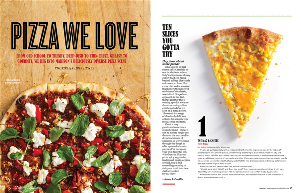
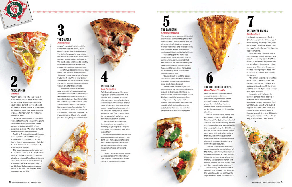
Just Jena does not even know how to begin a Blog. Because I don’t know how to begin a blog, I found an “About Me” guide to help me write this section. Whenever you see a question, it is a prompt from the “About Me” guide.

Right now in 2020 I am about the following:

  • Home & Family – Everyone is living at home – Seth (24), Danielle (23)
  • Church – In my 4th year as Sunday School teacher to the 12 turning 13 year olds – I taught most of the teenagers I have in Sunday School in Nursery where I served the first 10 years in the ward.
    • 1st year (2017) – Students: Aubrey Wright, Anna Davis, Megan Seppi, Brooklyn Northcutt, Ryker Baughman, …. Pearson, Abby Baldwin, +4),
    • 2nd year (2018) – Students: Faith Earl, … Anderson, …XXX, Sebastien Sarmianto, …. Moon), (
    • 3rd year (2019) – Students: Lacey Gee, Alyssa Clements, GIRL-silverlake, ….. Sarmianto, Kelly Northcutt, Seth Larkin, …Boy-dad EQ Pres, …Boy-next door, …Girl-cul de sac, Girl, Jack’s brother,
    • 4th year (2020) – Students: Sam Nettesheim, Emma Snowden, Amy Davis, Espi ……, Haley Lopez, Hailey Tetro, Gage Baughman, Jack …..)
  • Work – After being a Receptionist (1987), Admin Asst (1988-1990), Exec Asst (1990 – 2019) for 22 years, I was promoted to a new career as a Sr. Operations Coordinator. I love the work, it is working with Operations in the Tech Dept, it is fun and exciting.
  • School – I took a few college courses right out of high school, but couldn’t afford to pay for it myself, so decided to work instead of go to school. In 2018, I found out about a program that the Church had called Pathways Worldwide. You took 2 courses/semester (mostly your Generals, and religion) for 3 semesters, then you can apply to BYU-Idaho to do the Online Degree program. I was proud of myself, I made Straight A’s all 3 semesters and graduated Pathway’s with 15 College Credits. I was accepted to BYU-I and took 2 classes my first semester and made straight A’s in both classes. I decided to get brave and take 3 classes (9 credits) this second semester and my straight A’s school came to a screeching hault. I am taking Advanced Word (I do have an A in this class), but in my Business Applications class (Excel on steriods), I have totally dropped the ball and have received 0’s on a few assignments so far. Then finally Visual Media (which is the reason I started this Blog) which is also kicking my hiney as I have never worked with Adobe InDesign, Illustrator and Photoshop before and the learning curve is so large that I spend at least 30 hours a week on this one course.
  • TV & Puzzles – usually these 2 things are part of my life, but not this semester, all I do is get up go to work, come home, schoolwork till 1am, go to bed and do it all over again, except on Saturday and Sunday when I do school all day Saturday, and after church till 1am on school.

Other Stuff

Not sure what I want to use this Blog for, but I can write down things that I value in life (in alpha order), that I value in friends and family, what I wish for my children and things I want to work on……..

Accomplishment, Achievement, adaptability, adventure, affection, amazement, ambition, amusement, anticipation, appreciation, Approachability, Articulacy, Assertiveness, Availability, Balance, Being the Best, Belonging, Benevolent, Bravery, Candor, Capability, Challenge, Charity, Cheerfulness, Clarity, Cleanliness, Closeness, Comfort, Commitment, Compassion, Composure, Confidence, Connection, Consistency, Contentment, Contribution, Conviction, Cooperation, Cordiality, Courage, Courtesy, Craftiness, Creativity, Credibility, Curiosity, Daring, Decisiveness, Delight, Dependability, Desire, Determination, Devotion, Devoutness, Dignity, Diligence, Discipline, Discovery, Discretion, Diversity, Dreaming, Drive, Eagerness, Ease, Education, Effectiveness, Efficiency, Empathy, Encouragement, Endurance, Energy, Enjoyment, Entertainment, Enthusiasm, Ethics, Excellence, Excitement, Exhilaration, Expectancy, Experience, Expertise, Exploration, Expressiveness, Extroversion, Exuberance, Fairness, Faith, Family, Fascination, Fearlessness, Fitness……….. There is so much more, this is only thru the F’s, I’ll have to finish when I have more time: Whitney English

Other Advice from the article:

  • Why are you blogging publicly, rather than keeping a personal journal? Trying to figure this out. I don’t keep a journal, but I need to, now that my mom is gone, her journals are so awesome to read.
  • What topics do you think you’ll write about? Schoolwork assignments (because I have to), pictures of Life with the Hancocks, memories of Mom and Dad Hancock now that they have passed, and so much more.
  • Who would you love to connect with via your blog? Friends, family, and other special people in my life.
  • If you blog successfully throughout the next year, what would you hope to have accomplished? Hmmm, a good habit of journaling, and keeping track of the important things in life, I don’t want to forget.

One of the wonderful things about blogs is how they constantly evolve as we learn, grow, and interact with one another — but it’s good to know where and why you started, and articulating your goals may just give you a few other post ideas. I love the idea of posting goals.

Can’t think how to get started? Just write the first thing that pops into your head. Anne Lamott, author of a book on writing we love, says that you need to give yourself permission to write a “crappy first draft”. Anne makes a great point — just start writing, and worry about editing it later. Good advice and that is what I have done here so far.

When you’re ready to publish, give your post three to five tags that describe your blog’s focus — writing, photography, fiction, parenting, food, cars, movies, sports, whatever. These tags will help others who care about your topics find you in the Reader. Make sure one of the tags is “zerotohero,” so other new bloggers can find you, too.

“CHRIST: The Light that Shines in Darkness”

Magazine Spread

This was my first time ever working in Adobe InDesign. Again a pretty big learning curve for me. Below is my first attempt at a 3 page Magazine Spread, as you can see it needs a lot of work. We did our first draft, and submitted for peer review.

Guidelines that we used when creating this Magazine Spread:

  • “BYU-Idaho Appropriate”
  • Use InDesign
  • 3 Pages; 1 Spread
  • 8″x10″ portrait page size
  • 2+ Column Layout
  • 600 + Word Article (Found on LDS.org or BYUIScroll.org)
  • 600+ words do not need to fit on 3 pages, simple use “Continued on page #” at end of 3rd page
  • Break the article up w/3+headings/subheadings
  • 1+Pull Quote(s)
  • 2+ Relevant Images (Shot by student this semester)
  • 1+ Word Wrap (image or shape)
  • Consistent headings and body copy
  • Contrasting typography

Magazine Spread – Cover Page – by Jena Hancock

We had to do a 3 page Magazine Spread – below is my 2nd page – 1st Draft

Magazine Spread – 2nd Page – by Jena Hancock

This is my 3rd page of my Magazine Spread first draft

Magazine Spread – 3rd page – by Jena Hancock

Games People Play

This was the first time I ever worked in Illustrator so there was a huge learning curve. This was my first draft turned in for Peer Review.

Icon Set by Jena Hancock

This was my second draft after my peer’s reviewed and gave me some feedback.

Icon Set by Jena Hancock

This was my final draft that I turned in to my instructor, still not perfect, but as good as I could do for learning Illustrator for the first time.

Icon Set by Jena Hancock

Slim-Fast

Slim-Fast Disruption Ad

Need to lose a little weight before your wedding?

Great ad by Slim-Fast

Repetition

The repetition I see in this ad are …..

Alignment

The alignment examples I see in this ad are …..

Proximity

Examples of proximity in this ad are …..

Color

Color in this ad is ……

Conclusion

The principles of design (CRAP) are present in this ad created by Slim Fast. While the ad can be controversial in context, it could be taken differently by different audiences.