
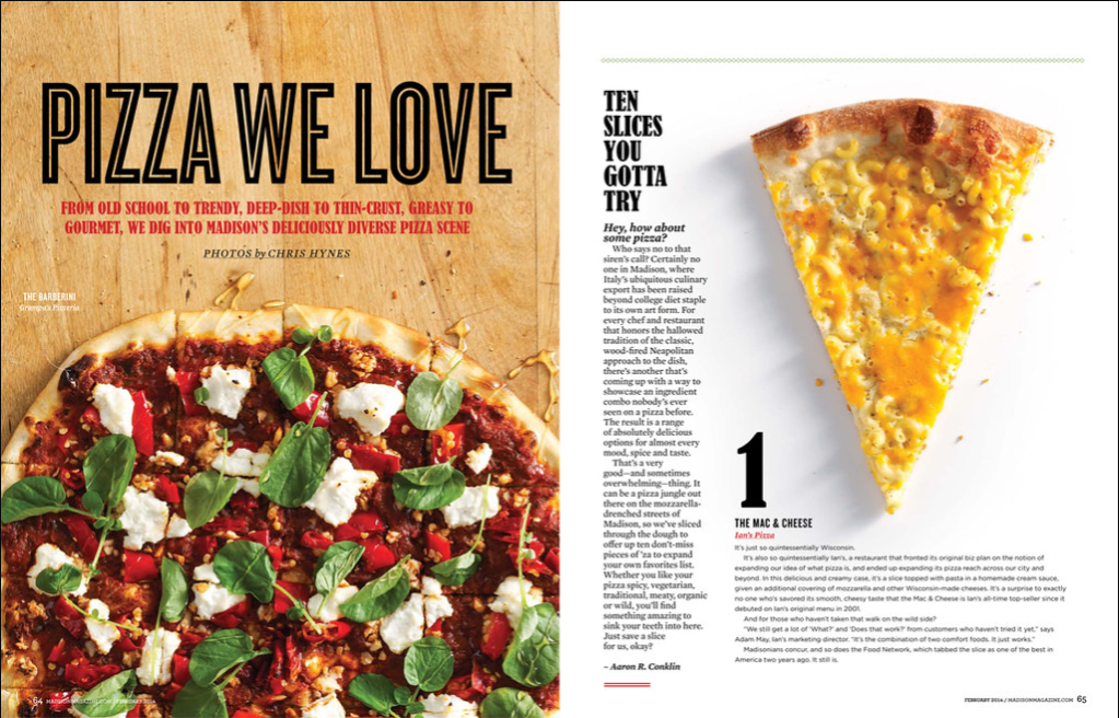
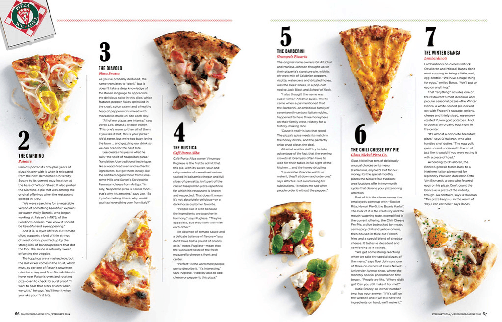
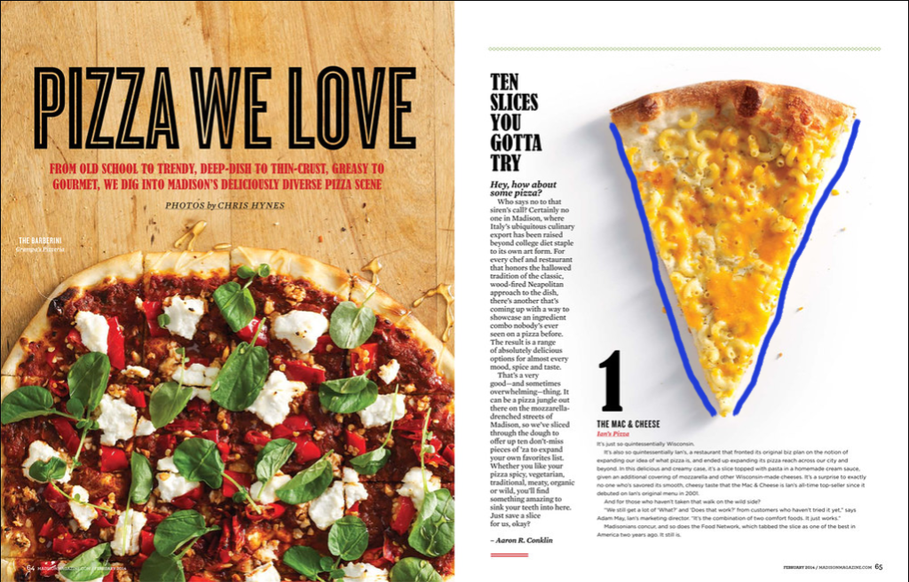
Pizza We Love, 2-Page Spread, Madison Magazine – Photos by Chris Hynes.
Original magazine spread found here here
Category Identification
The Category of the 2 typefaces are Old Style & Modern
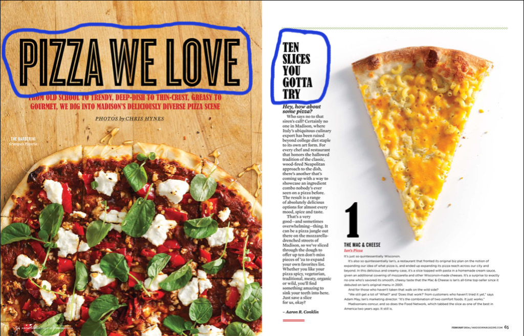
Typeface Contrast
There are several typeface contrasts in this magazine spread
- The size of the of”Pizza We Love” and the “1”
- Weight of the “Ten Slices you gotta try” and “1”
- Color of the “From old school to trendy”
- Also the size difference between “Pizza We Love” and “From old school..
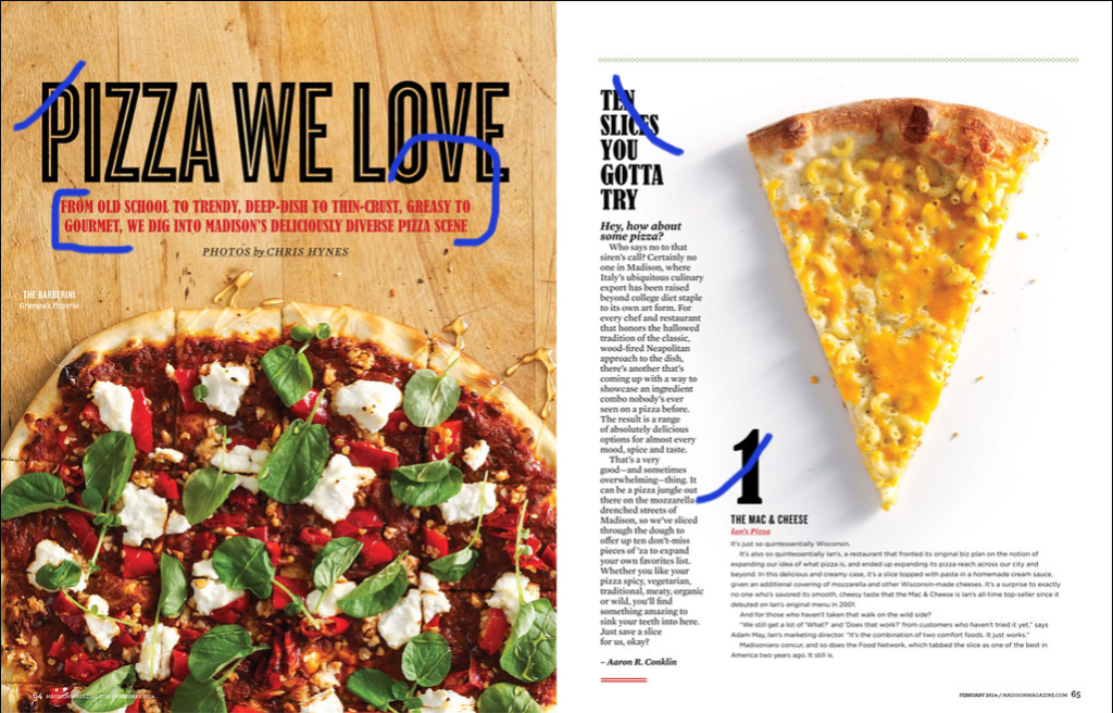
Photography – Leading Lines
The photographer utilized leading lines (in the pizza slice). Also, the lines in the pizza are also leading lines although they are more hidden.
Alternate Images
I was able to mimic the images in the magazine spread by having my husband make one of his homemade pizza’s, then I had him put on his wooden board and I photographed it before it was sliced pulling the pizza down 1/2 way on the board as in the magazine photograph. I then had him slice the whole pizza so that I could also use the leading lines of the slices, but in the whole pizza. Finally I pulled one of the slices out and photographed it to match the 2nd page of the magazine spread.
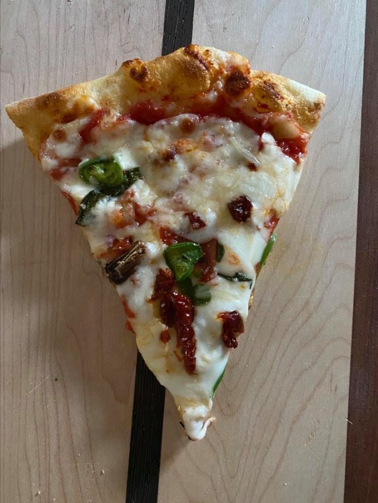
Homemade pizza made by Richard Hancock
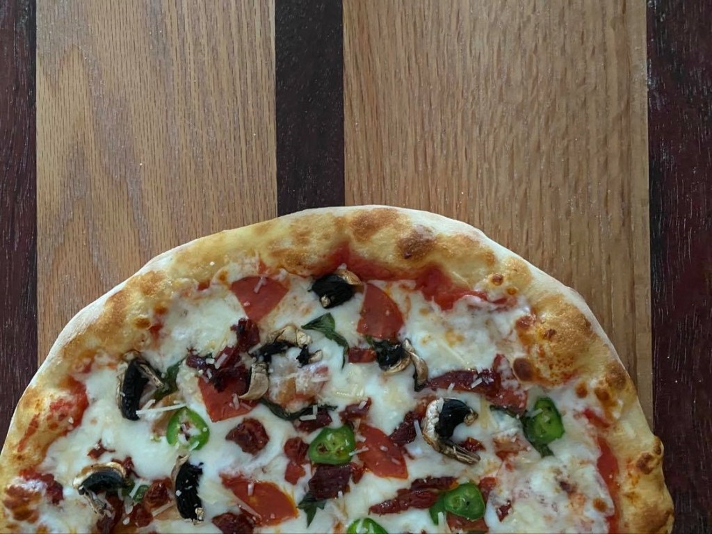
Homemade pizza made by Richard Hancock
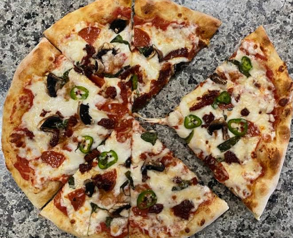
Homemade pizza made by Richard Hancock
Summary
The above principles contribute to the design in several different ways. The bold fonts used in the article catch your eye right away. It is also easy to see the leading lines in a pizza. And finally I chose something that I knew that I would be able to photograph that would also fit into the magazine easily.
